One Android user scrapped the standard app-grid Home Screen and rebuilt it around the moments of his day — morning, commute, work, evening — grouping tools by context rather than category.
The shift is simple in practice. Instead of hunting through rows of icons, each screen surfaces only the apps relevant to a specific part of the day.
The Problem With App-First Design
Most Android home screens organize around apps as objects — social media here, productivity there, utilities somewhere else. That layout mirrors how a phone’s software library works, not how a person actually moves through a day.
Still, it’s the default most manufacturers ship, and Most Users Never change it.
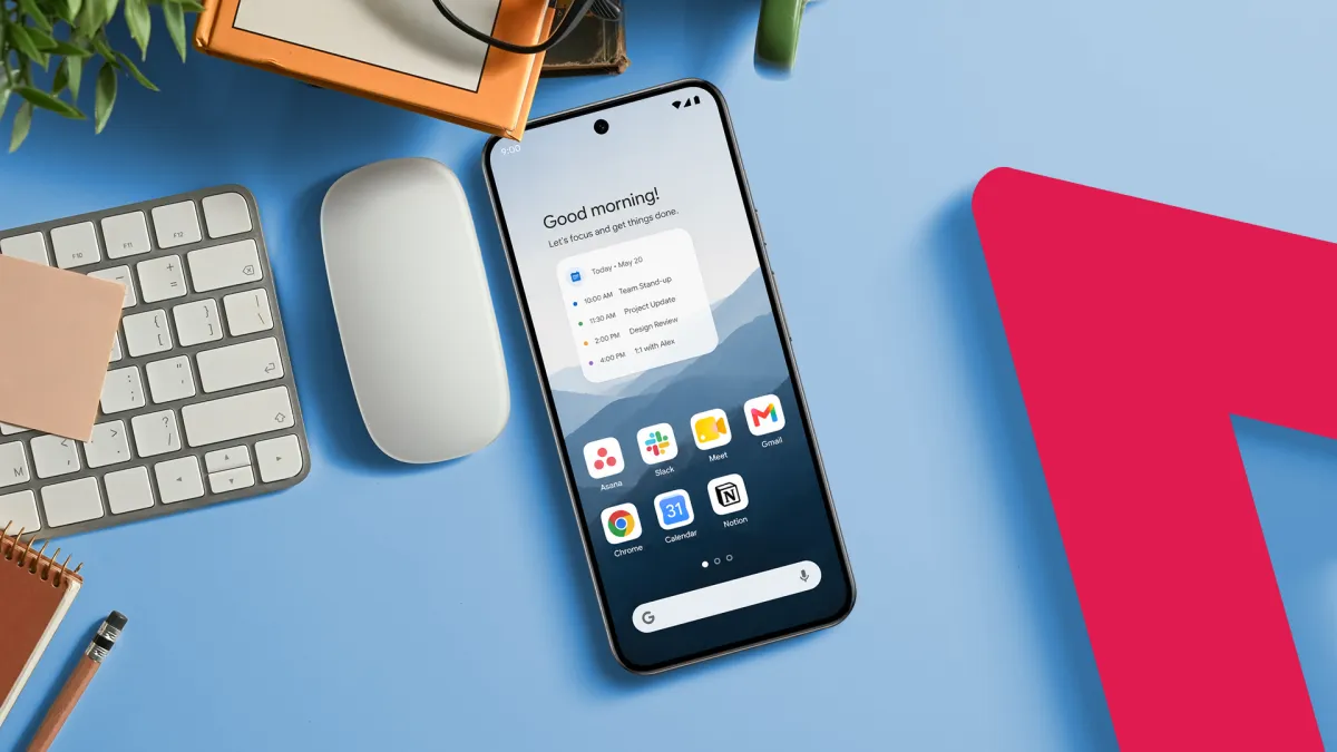
The moment-based approach flips that logic. A morning screen might hold a weather app, a news reader, a coffee-shop loyalty card, and a meditation timer — nothing else. A work screen holds only communication and task tools.
What Changes in Practice
Clutter drops immediately. Fewer icons on any given screen means less visual noise and fewer impulsive taps toward distracting apps.
That matters. App Annie, now data.ai, reported that global consumers spent an average of 4.8 hours per day on mobile apps in 2021, with much of that time driven by unplanned app-switching.
Moment-based screens add a small but real friction to that pattern. Reaching a social app during a work session requires a deliberate swipe to a different screen — enough resistance to break an automatic habit.
How to Build It
Android’s home screen customization tools make this feasible without third-party launchers, though apps like Niagara Launcher or Nova Launcher offer finer control.
The first step is mapping out the distinct moments of a given day — typically four to six for most people.
Each moment gets its own screen. Apps land on whichever screen matches the context in which a user actually reaches for them. Widgets — live displays that show information without requiring an app tap — reinforce each screen’s purpose.
A morning screen widget might show today’s calendar at a glance. An evening screen widget might display a reading list or a sleep-tracking summary.
The Minimalism Connection
This approach shares DNA with minimalist home screen design, which strips icon counts down to single digits to reduce cognitive load — the mental effort of processing visual information.
Research published in the journal Computers in Human Behavior has linked high smartphone screen complexity to increased stress and reduced focus.
Moment-based design Does Not require minimalism, but the two reinforce each other. Fewer apps per screen naturally follows once context, not habit, drives placement.
Android’s open customization model gives users more latitude here than iOS, which only recently introduced home screen personalization features in iOS 14.